7 Steps to Classroom Design
.jpg)
There is much to think about when setting our classrooms up for the year: What should go on the walls? Where do the student desks go? Where does my desk go? Do I even need a desk? Where will I meet with small groups? With so many questions swirling in our heads, we need a systematic way to construct our rooms.
In the past, we started by placing student desks in the room first. However, we found they took up so much space that we were left with very little real estate for the sections we really valued and craved, such as a functional library and a whole-group gathering space. So we shifted to beginning with what we deemed most important and the message we wanted to send to students and adults who came into the room. Now we start with the things we value most, and tuck everything else around them.
To begin with a clear head, we move everything out of the room. "Really?" you ask. Absolutely! We want a truly clean slate and to look at the space with new eyes. Once everything is out of the room, we follow a prioritized order for bringing it all back in.
Ready to set up your room or make it over midyear? Try this system. If you follow this sequence, we think you'll end up with the classroom design and feel you are hoping for.
- Teacher Space—We do like to have a spot in which to work, plan, and reflect. However, we don't want our space to command more than its proportional amount of real estate. We select a spot that will be functional, and will be part of the teaching and learning space. Students are typically invited to share the desk or table when they are in the room.
- Large Meeting Area—There are many reasons why we are firm believers in having a group gathering space for short bursts of instruction: students know when they gather in our group spot that they will be listening to one another or to us, the many possible distractions found in desks are removed, and it is easy for students to turn and talk. We love to define this space with an area rug, but if your school doesn't allow this, the space can easily be quartered off with furniture in the room.
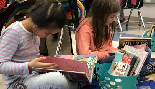
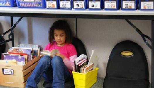
- Class Library—We look at the room and decide if we'd like a cozy den-type of library or if we want the library to be spread throughout the room to optimize browsing potential. We organize by genres, topics, and authors, with numbers on the tubs and the backs of the books, so students can easily find books of interest and return them where they need to go.
- Technology—Desktop computers, laptops, and tablets need a place where they can be monitored and used effectively.
- Student Work Spaces—Since our whole-group instruction is delivered in the gathering space, we don't feel compelled to have a desk for every student in the room. A variety of choices are available when students go out to work independently:
- A couple of tables where four to six students can sit in chairs comfortably
- A low table where four to six students can work while sitting on the floor
- If district regulations allow, a few comfortable chairs or benches, or a love seat
- A couple of high desks for students who would like to work while standing
- A few desks in more private corners for students who like privacy and freedom from distractions
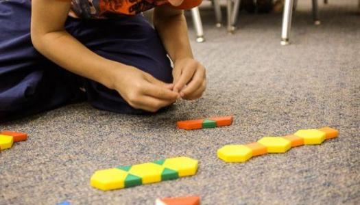
- A few throw pillows and small area rugs for students who want to work on the floor
We check to make sure we have areas for small-group work, partner work, individual quiet areas, and larger discussion and work spaces.
6. Storage areas—Items that won't be used daily (such as science materials and art supplies) can hide in our closets, but the following categories need to be out and organized in a way so students can be highly successful in finding and maintaining the materials:
- Individual student supplies
- Math materials
- Writing resources
- Word work supplies
- Book boxes
7. Finishing touches—These final touches turn our academic schoolroom into a warm, welcoming environment:
- Walls—Displays are for highlighting student work and chronicling our learning journey. To get away from the visual noise and business that results from multiple thematic borders, we stick to one color, usually black, so the eye is drawn to the work inside, not the design that holds it. We put up content menus and designate places to feature student writing, art, and math strategies and games.
- Lighting–Fluorescent lights can be troublesome to highly sensitive children or those with attention problems. We use natural light as much as possible, and if district regulations permit, we bring lamps in.
- Plants–It really doesn't matter if they are real or fake. Having "living" things in the room brings the calming presence of nature with them.


